
100 Developer Tool Landing Pages Analyzed: Design Principles That Work in 2025—Martian Chronicles, Evil Martians’ team blog
This post was translated from Chinese by AI. If anything reads oddly, the Chinese original is authoritative. 中文原文
First published: https://www.sunai.net/t/topic/938
Translated from: https://evilmartians.com/chronicles/we-studied-100-devtool-landing-pages-here-is-what-actually-works-in-2025
So, you’ve built a great open-source project or developer tool. Now you need a landing page that doesn’t suck! You could spend weeks researching what works, running A/B tests, and agonizing over design decisions. Or… you could overcome “blank-page anxiety” by learning from the best developer tools in 2025. To save you time, Evil Martians design lead Anton Lovchikov analyzed more than 100 developer tool landing pages, from Linear to Vercel to Supabase. Here’s what works, based on data from real companies. (And we’ve turned this research into an open-source template you can launch in minutes.)
Based on our research, here’s how to structure a landing page for an early-stage product:
General layout notes
Before diving into individual sections, here are two rules that almost every developer tool landing page follows:
- No sales fluff.
- Smart and concise wins.
Most pages avoid flashy interactions and focus on clean design: solid typography, clear layouts, and plenty of whitespace. This makes sense: early-stage teams need to move fast, validate ideas, and attract users. The fancy stuff can come later.
Almost every page uses a centered layout with a max-width container. It’s simple, readable, and easy to build. Some pages go full-width, which feels more polished but is harder to pull off. Done well, it can really stand out.
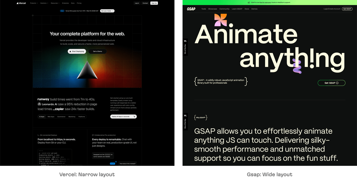
Hero section
Summary: Use a centered composition with a static or animated product preview and compelling CTAs.
In 2025, the hero sections of most developer tool landing pages follow a remarkably consistent pattern.
Centered composition
In the vast majority of examples, the hero section is centered: a bold headline sits in the middle of the screen, with supporting visuals below. It feels solid and trustworthy, and it works well.
Only a handful of sites use a split layout (text on the left, visuals on the right). This looks more like a traditional SaaS page, but it’s uncommon among developer tools.
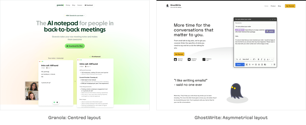
Primary visuals
The visuals in the hero section vary by product maturity and type:
1. Animated product UI
Adds motion and shows more product details. Great for demos, but takes more effort to prepare.
https://evilmartians.com/static/02ac1131b39277d74caa54cb65142b97/hero-animation.av1.mp4
[Playbook]: Animated product preview (we collected all the landing page screenshots in a folder for design teams to reference)
2. Static product UI
Perfectly viable and faster to implement, while still showing users what the tool looks like.
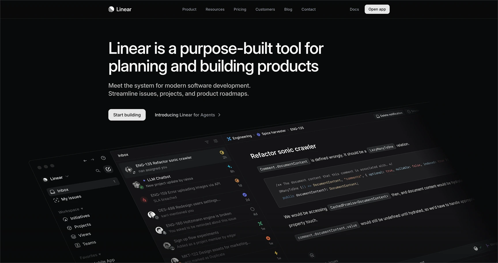
[Linear]: Static product screenshot
3. Switchable product views
Especially useful if your product has multiple use cases or features and your core message isn’t yet focused.
https://evilmartians.com/static/3e97d01544dfe9d39147bbcf5f6f1f9a/hero-slider.av1.mp4
[Mintlify]: Multiple switchable product screenshots
4. Embedded live product
Some small tools embed working UI elements directly instead of using screenshots. This suits single-purpose tools (such as image upscaling or background removal).
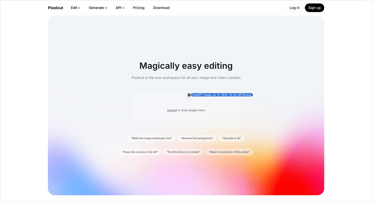
[Pixelcut]: Live demo in the hero section
5. Code snippets
Common for tools with little UI, such as libraries, SDKs, and infrastructure products.
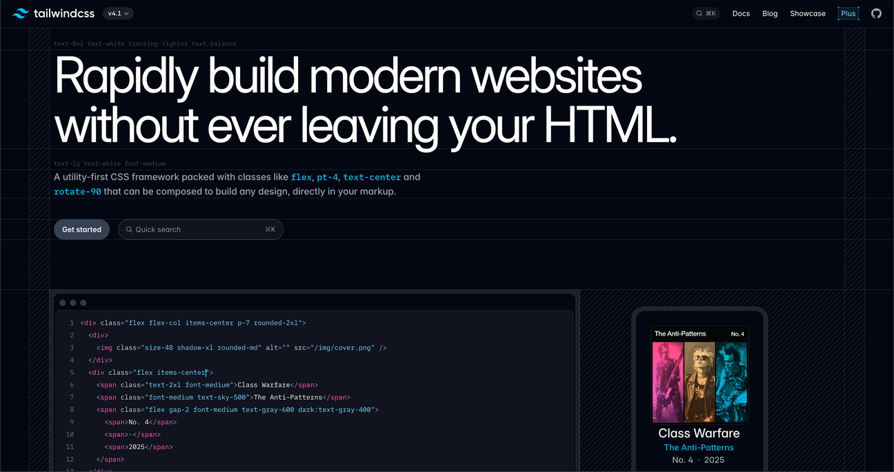
[Tailwind]: A code snippet as the primary visual
6. Abstract illustrations or no visuals
Useful when the UI isn’t ready yet, or when the product is an underlying service (such as observability or data infrastructure). Also common for stealth or pre-launch projects.
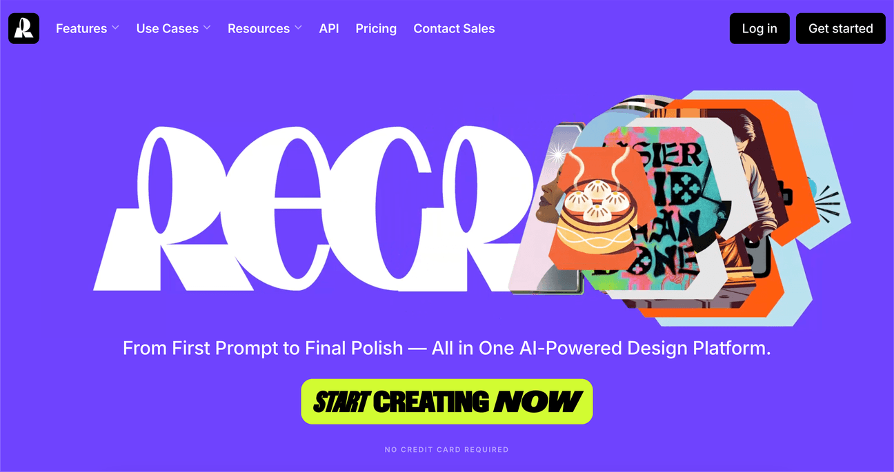
[Recraft]: Text instead of a UI preview
Eyebrows and banners
To convey momentum and progress (especially important for early-stage startups), teams add small elements to the hero section:
Eyebrow: Small text above the headline, typically highlighting a new version, funding, a launch, or similar news.
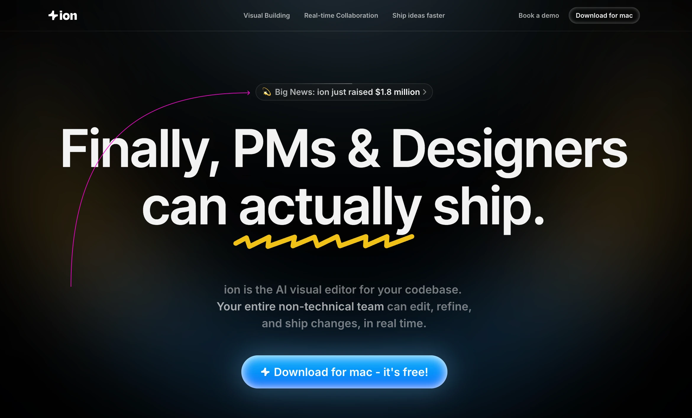
[Ion]: A promotional link highlighting a major milestone
Full-width banner: A banner at the top of the page with more text, serving a similar purpose.
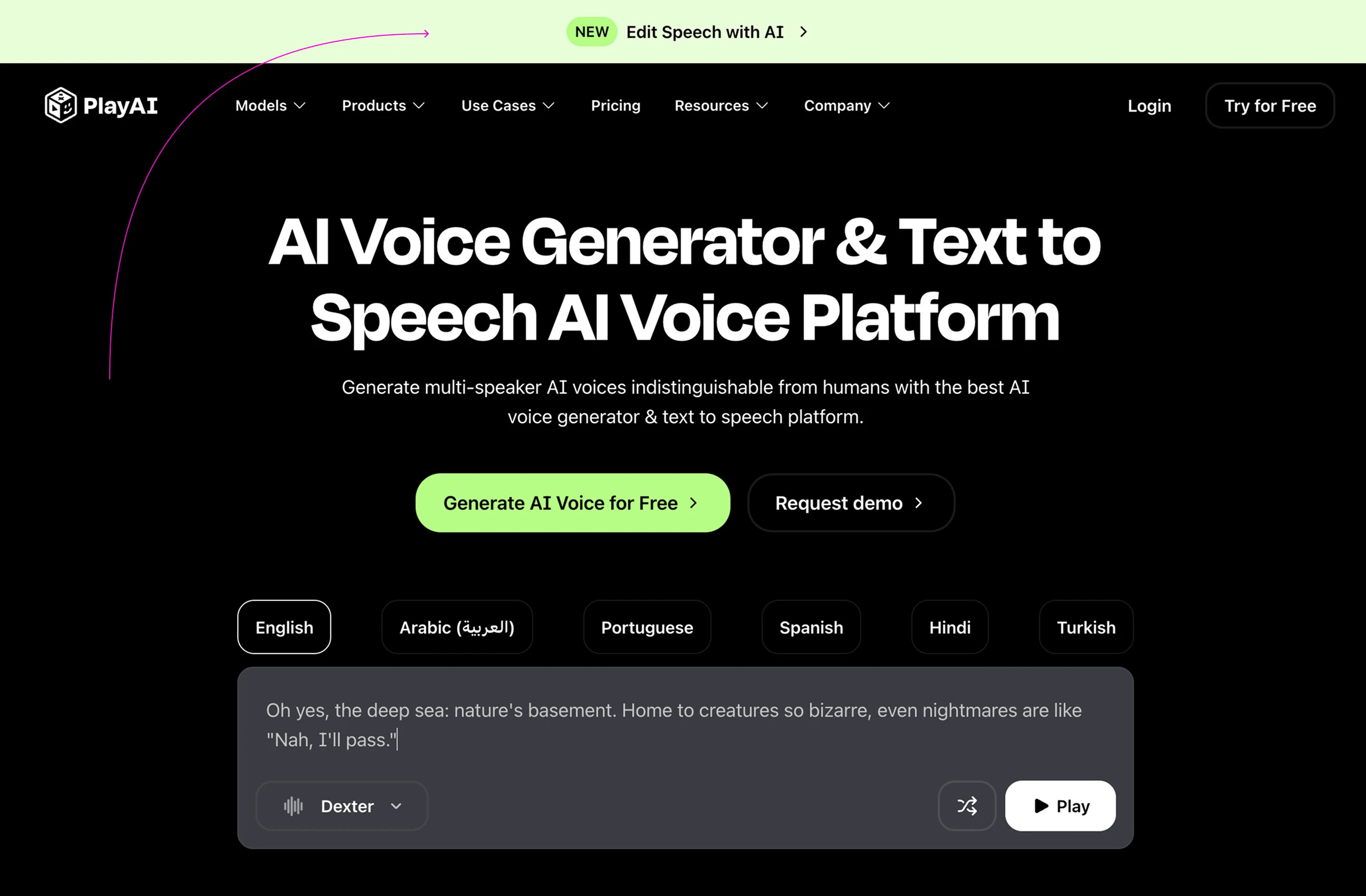
[PlayAI]: New feature announcement banner
Calls to action (CTAs)
Use two CTAs in the hero section to both convert paying users and offer developers immediate value (such as open-source code or documentation).
- Make the primary CTA visually prominent. Avoid generic wording like “Get started” and be specific: “Start building,” “Download now,” and so on.
- Give the secondary CTA (such as “View docs,” “Join the waitlist,” or “GitHub”) a distinct style so it doesn’t compete with the primary CTA.
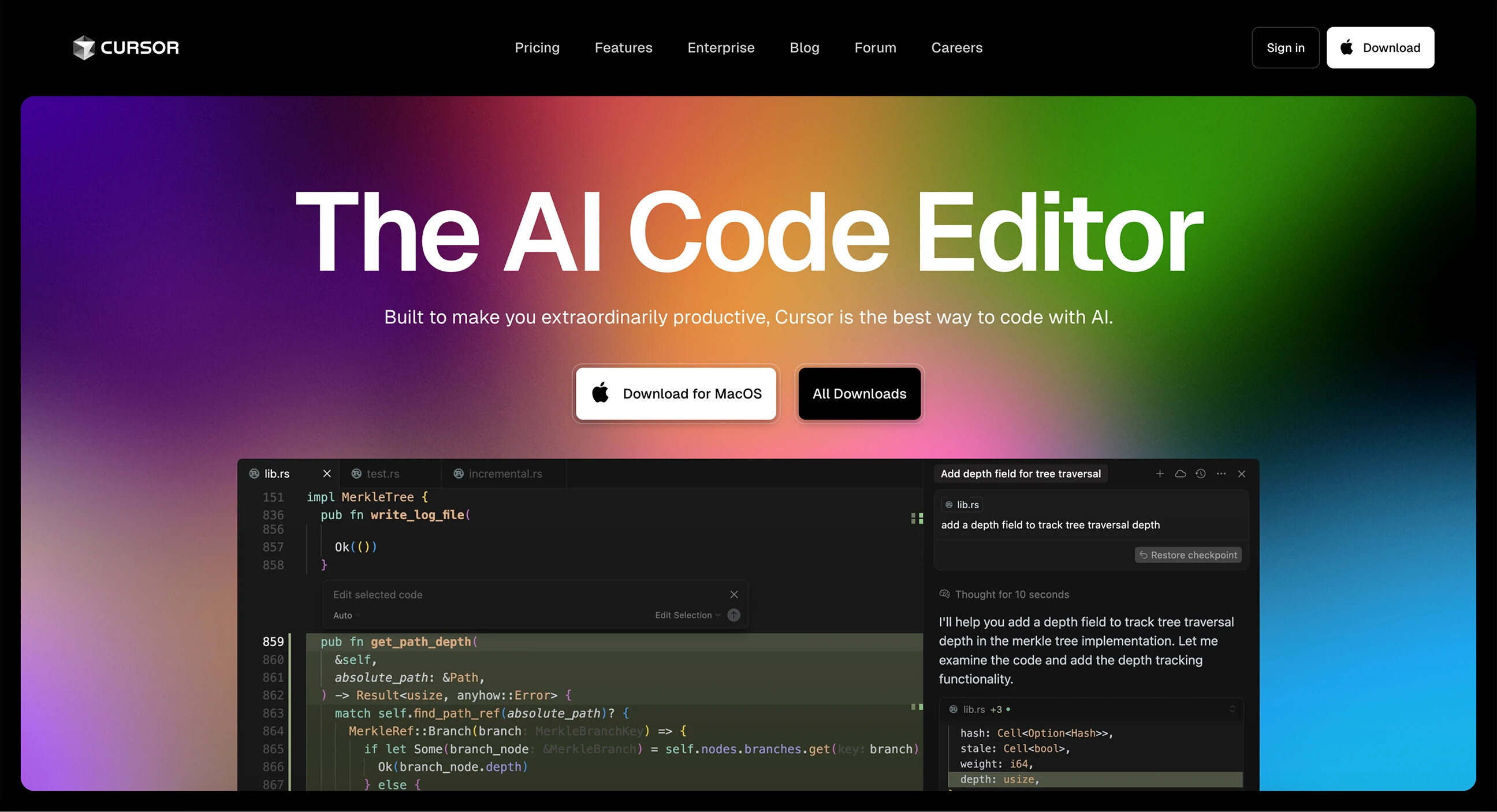
[Cursor]: Two differently styled CTAs
Trust section
Summary: Show notable customer logos or user activity metrics.
Most developer tool startups include a customer section, usually right after the hero section. This is the fastest way to build trust. If well-known teams already use your product, make sure to show it. Open-source users are users too.
This section takes two main forms:
B2B products
If your users are companies or teams, you’ll typically show recognizable logos. About half the pages use an auto-scrolling logo strip to save space. If there aren’t many customers yet, testimonials and photos can take their place.
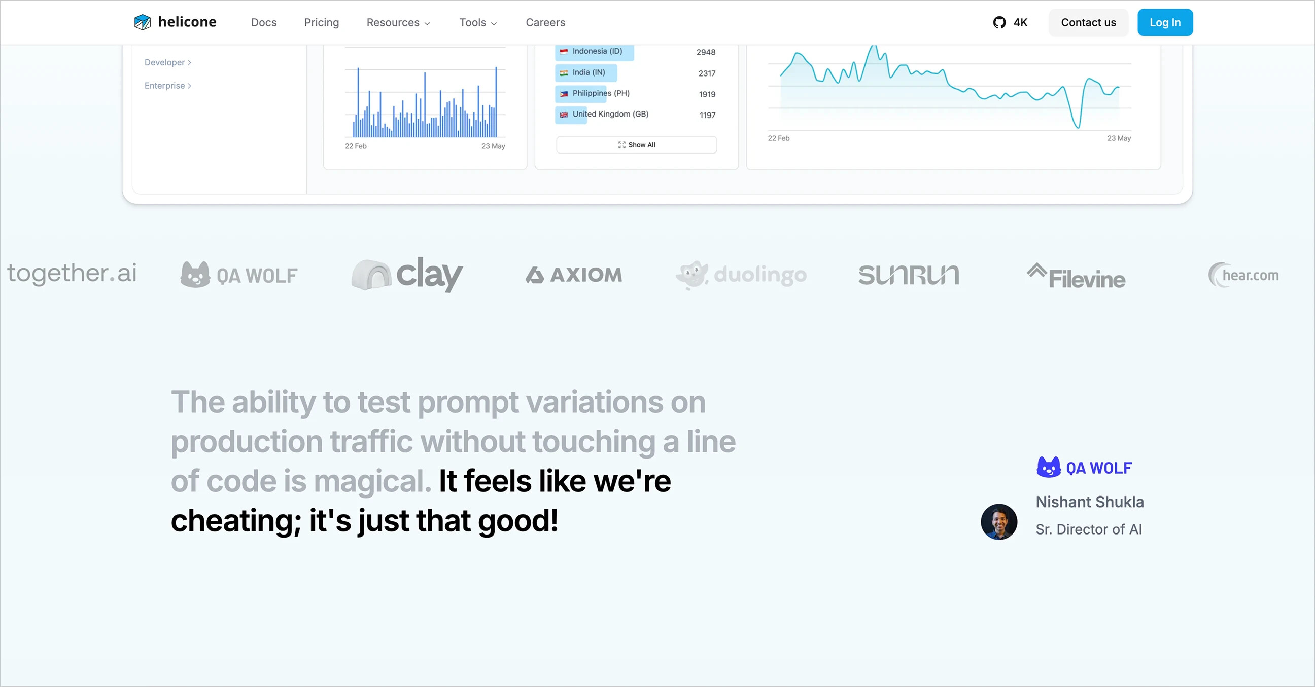
[Helocone]: Customer logo strip + testimonial
Services for individuals
Tools aimed at individual users, such as independent developers and designers, more often show big numbers: GitHub stars, usage metrics, awards, and so on.
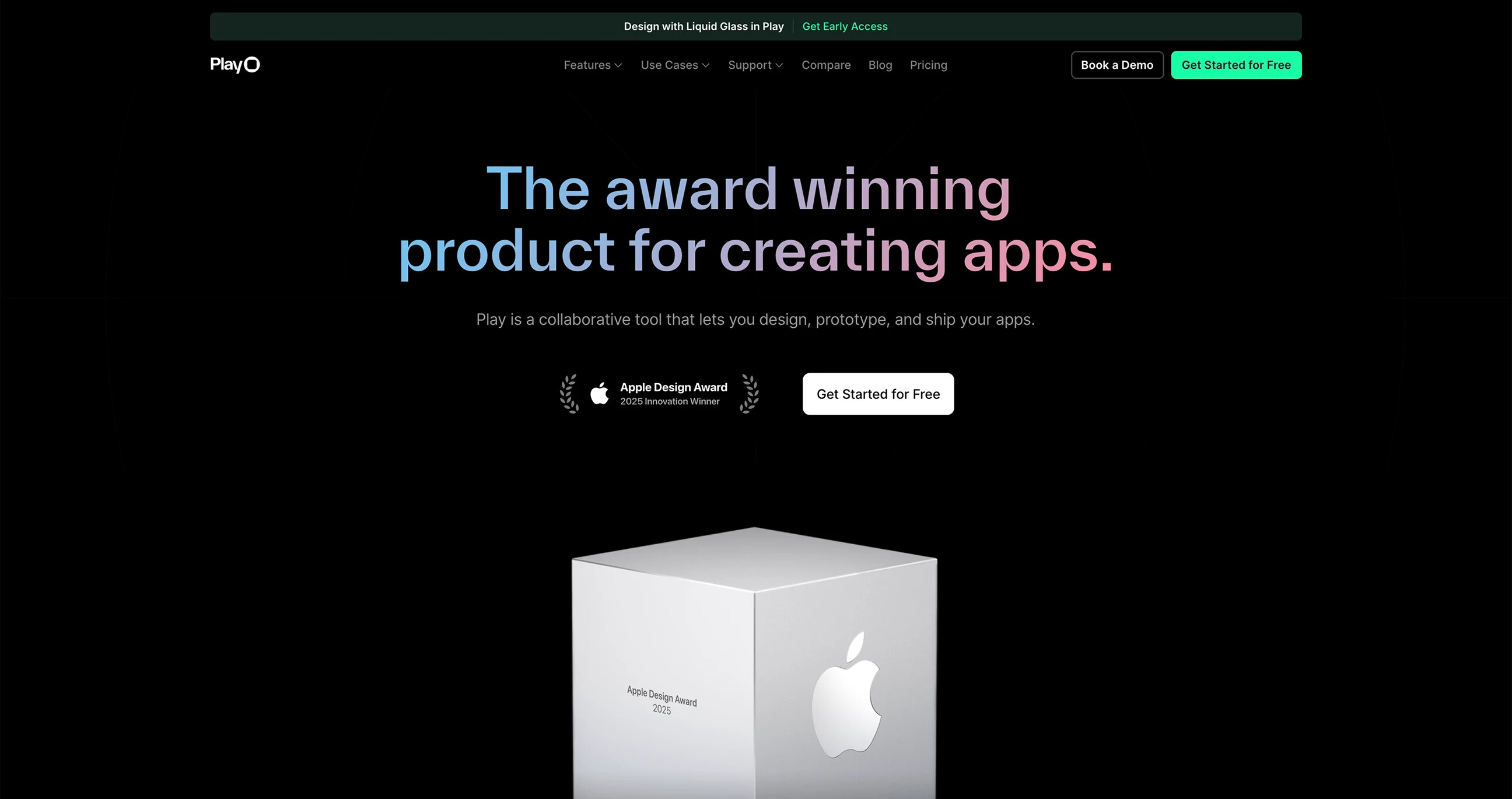
[Play]: Using an Apple Design Award to build trust
Sometimes they also use user reviews.
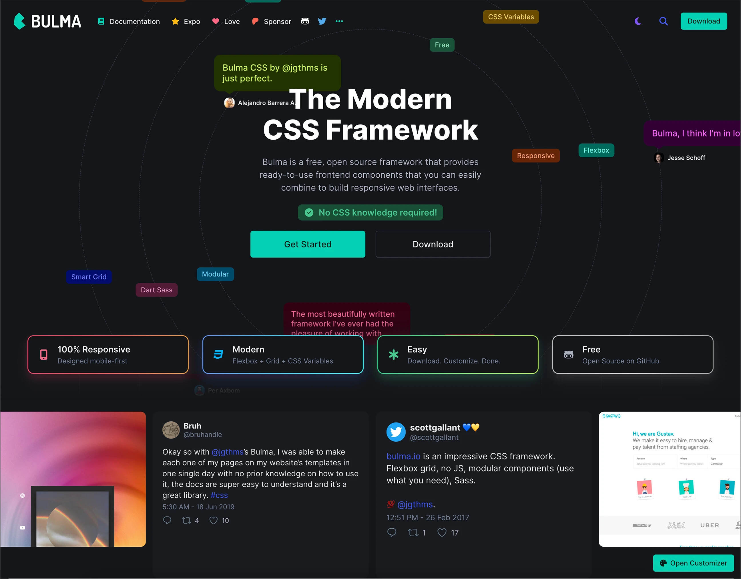
[Bulma]: User reviews immediately after the hero section
Features section
Summary: Focus on real user problems and how the product solves them, rather than simply listing features.
Once you’ve built trust, explain what the product does and why it matters. Across the more than 100 developer tool websites we studied, feature sections have two structural layers: narrative approach and page layout.
Narrative approach
Startups take different approaches to presenting features. Common ones include:
1. Feature list
The most straightforward but weakest approach. Simply listing features without context or rationale makes it hard to win users over.
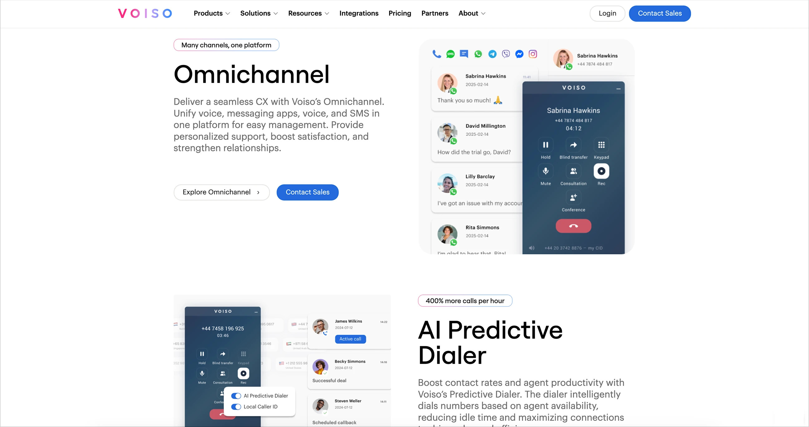
2. Action/task-oriented
Each section opens with a motivating phrase: “Build faster,” “Run anywhere,” “Go live in seconds.” Better than a plain feature list, but only moderately persuasive.
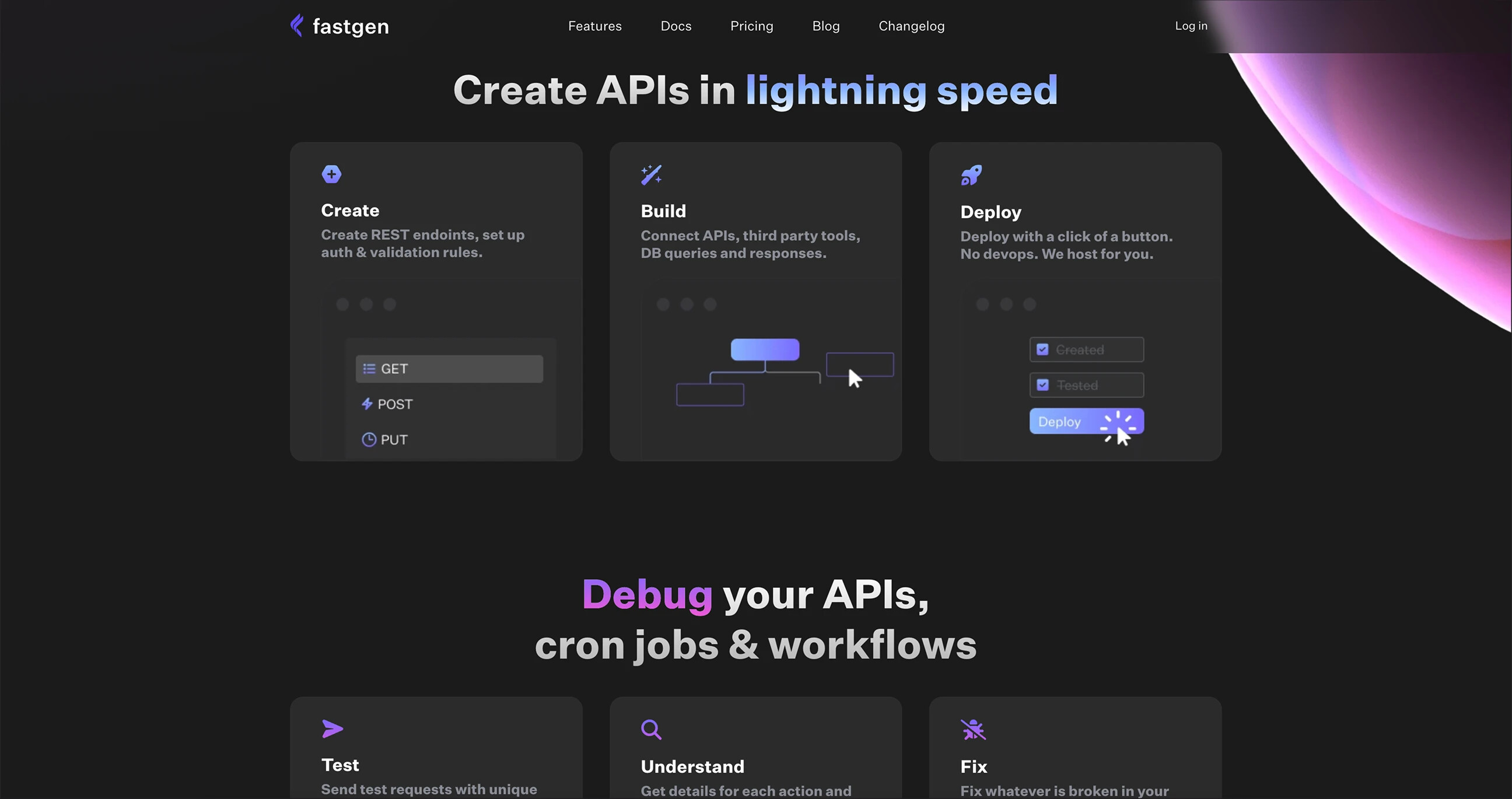
[Fastgen]: Clear, direct motivational phrases
3. Problem-oriented
More engaging and user-focused. Start with a pain point, then show how the product solves it. Harder to write, but more effective for early-stage products.
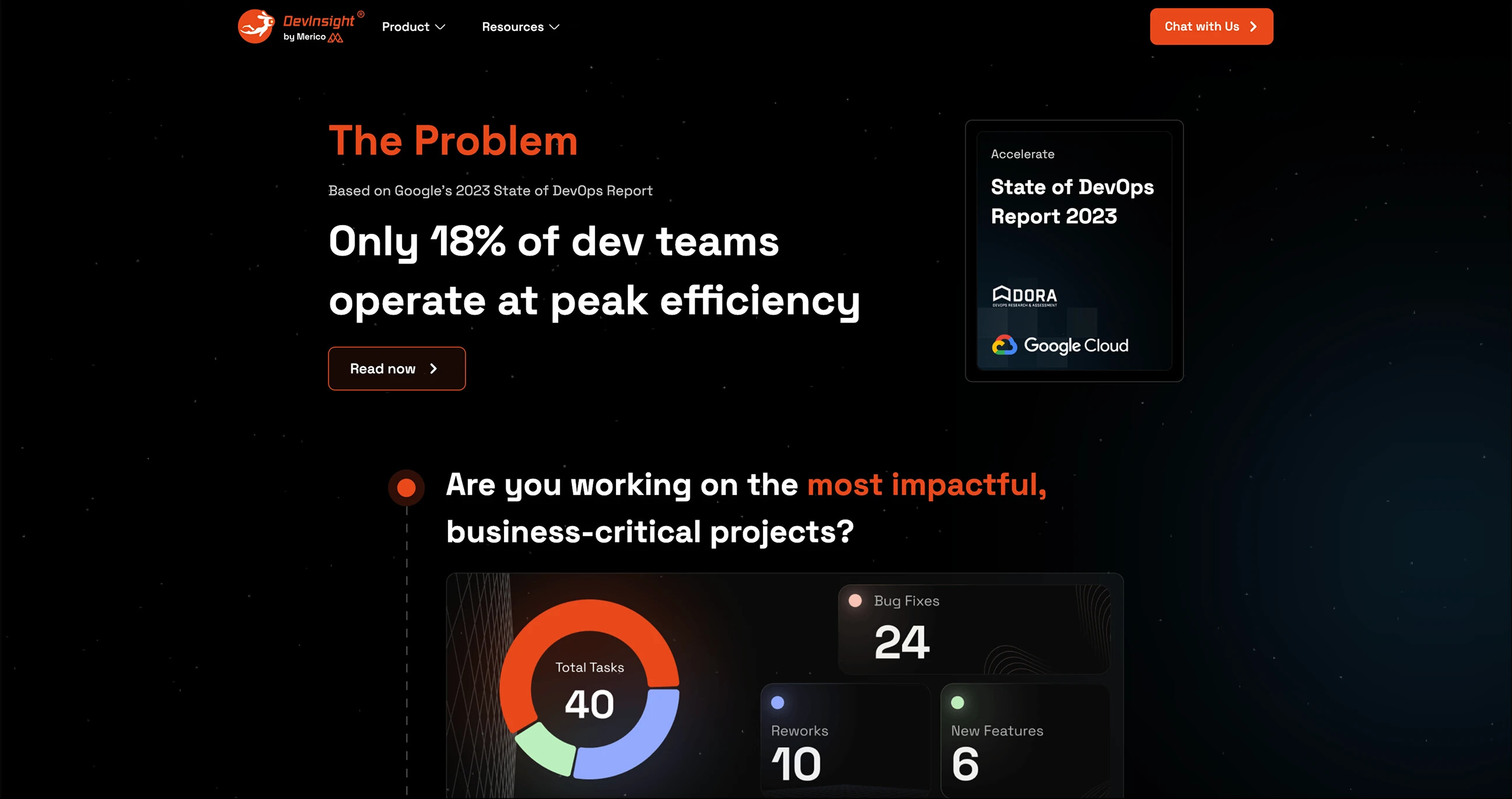
[Devinsight]: Start with a problem
4. Bold statements/taglines
Some products define each section with a confident, standalone phrase. Best for products that already have some recognition.
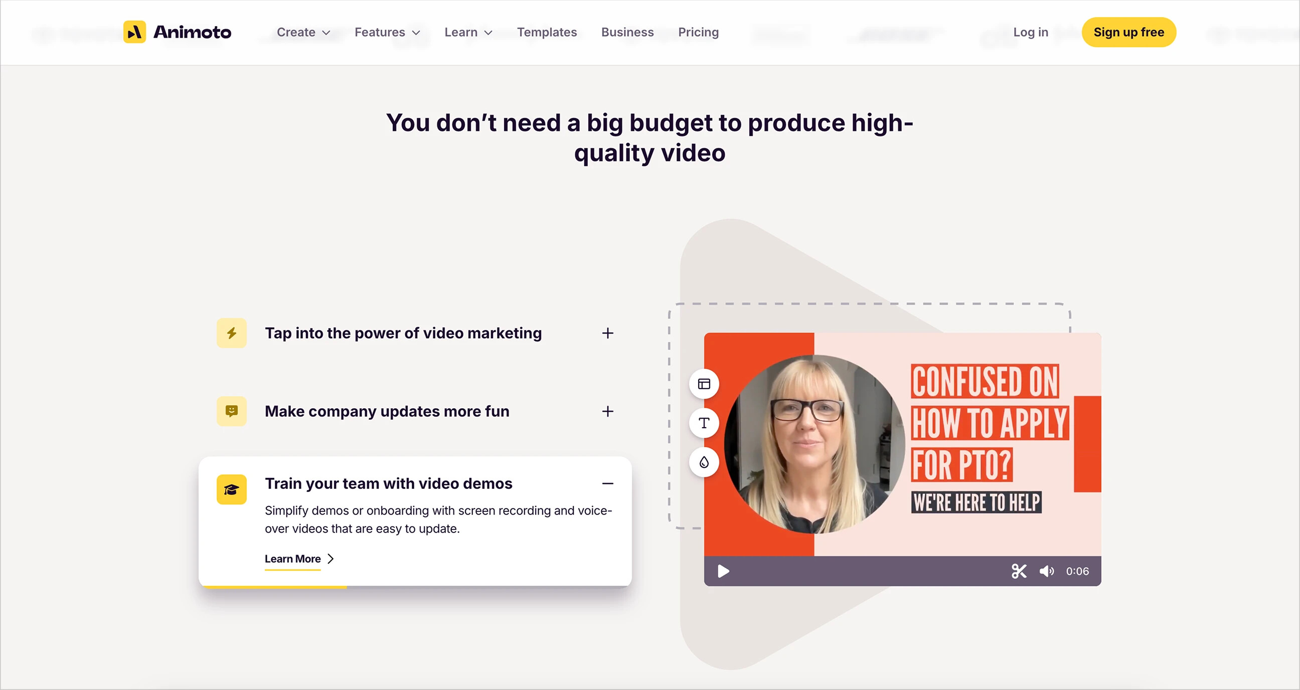
[Animoto]: Opens with “You don’t need a budget…”
5. Mission-driven storytelling
Rare but powerful. Instead of selling features, it shares a vision. Best for teams with a genuine sense of mission.
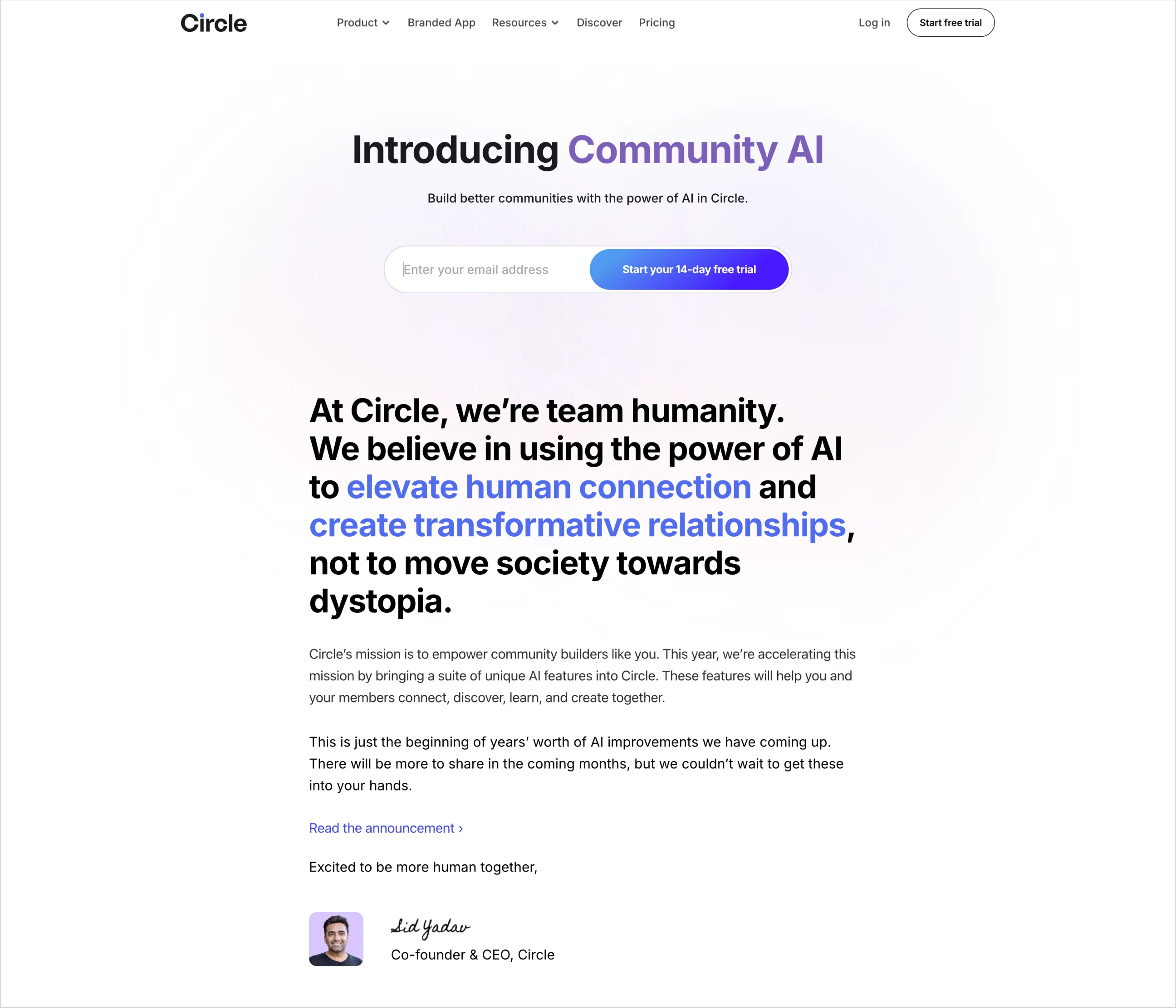
[Circle]: The CEO speaks directly about the mission
Layout formats
Once the story is set, the next step is deciding how to present it on the page. Common options include:
1. Full-screen screenshots + brief descriptions
Best for tools with rich UIs.
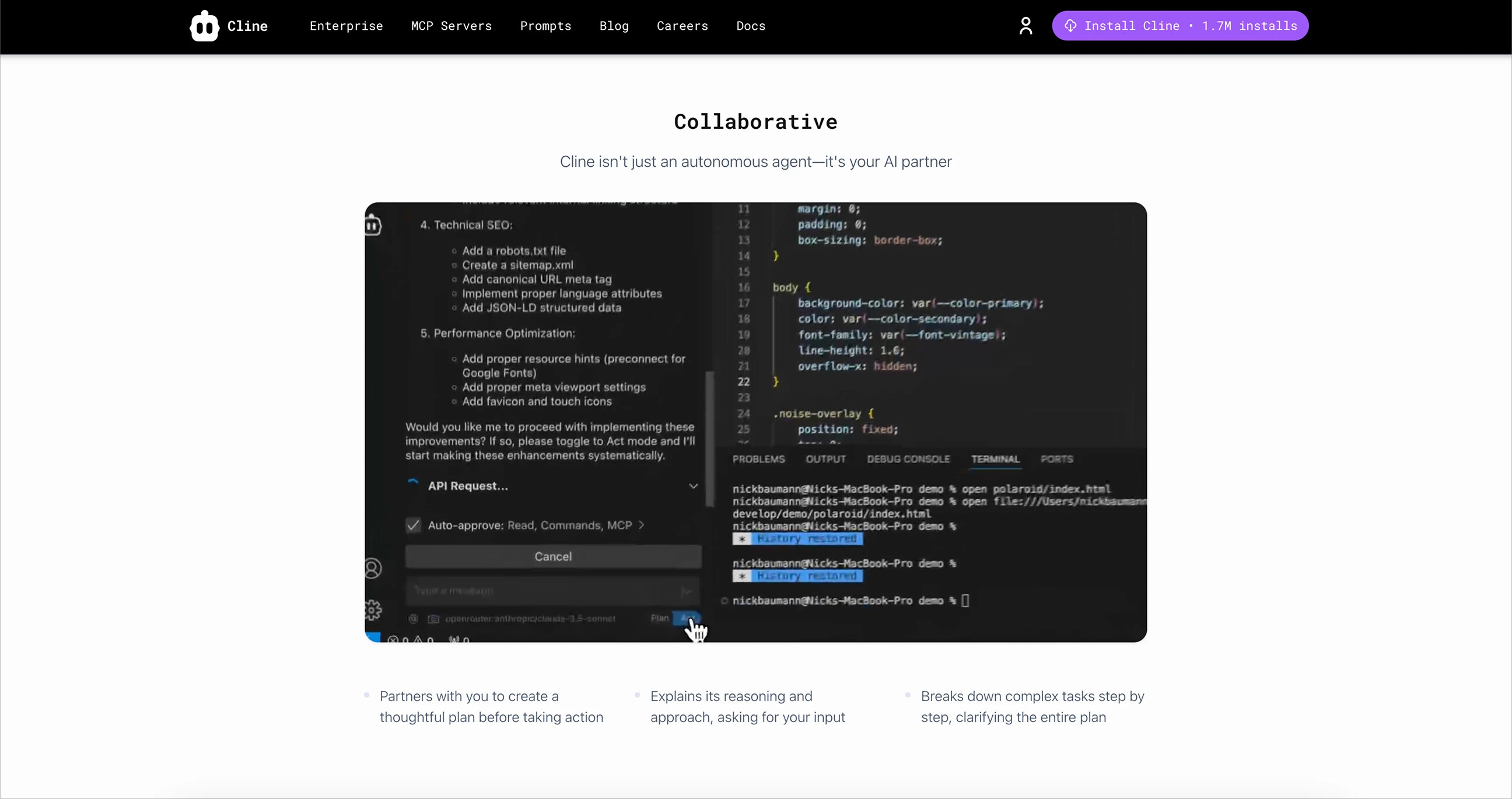
[Cline]: A screenshot and brief description for each feature
2. Checkerboard layout
Alternating image and text blocks on the left and right. Simple, easy to read, and adds visual rhythm.
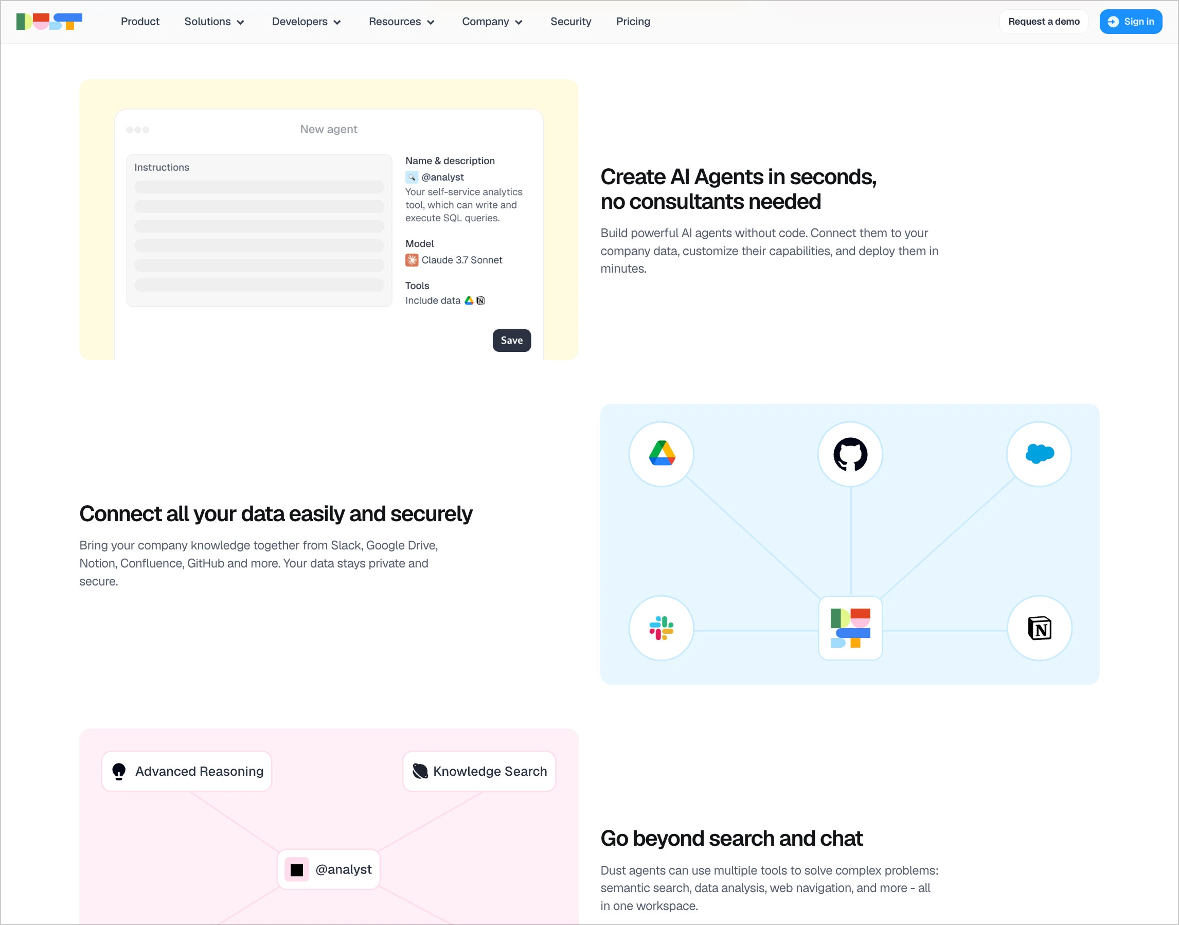
[Dust]: Checkerboard layout
3. Icons + text
Best for products with minimal UI or many features. An icon, heading, and brief description make each item easy to scan.
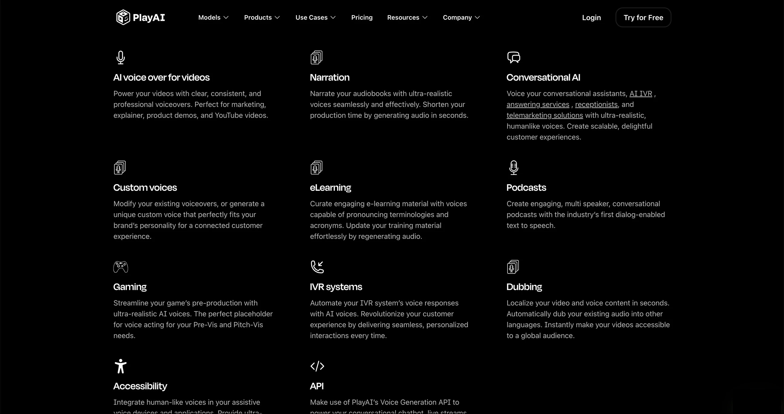
[PlayAI]: Feature cards with icons
4. Feature belts
Full-width, scrollable strips of cards or screenshots, ideal for showcasing many small elements.
https://evilmartians.com/static/4c0e9b7b7264cb5eb11d7acd58d67428/feature-belts.av1.mp4
[Flair.ai]: A gallery belt
5. Bento sections
A grid of cards in varying sizes. Information-dense, but requires careful layout.
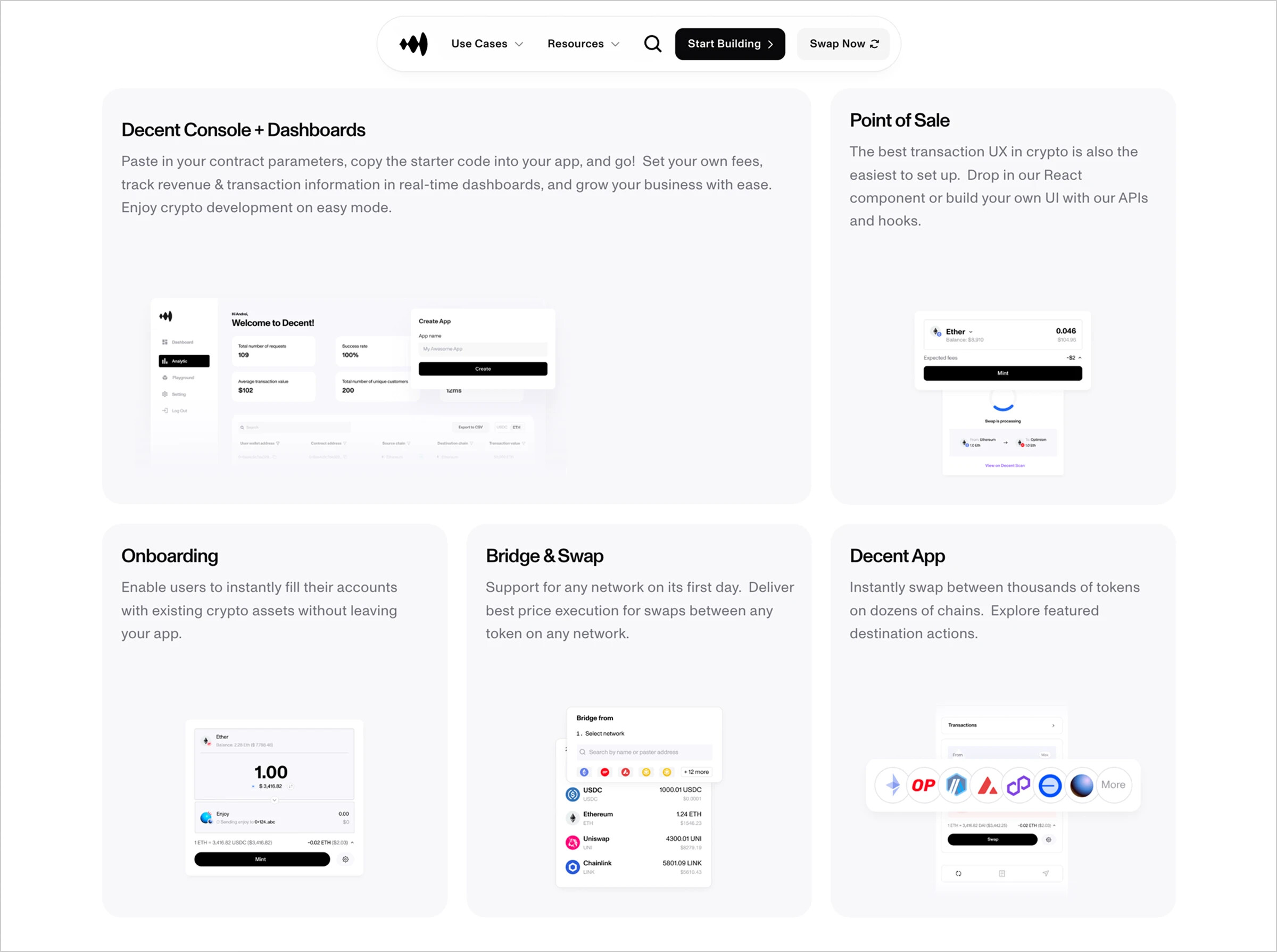
[Decent]: Bento cards break up the page’s rhythm
6. Tabbed feature sections
Group related features under tabs. Best for products with multiple audiences or feature groups.
https://evilmartians.com/static/7060da090eefe5f4da0b2c9d05e31dd5/feature-slider.av1.mp4
[Toggl]: Features grouped into tabs
7. Step-by-step layout
Best for showing onboarding flows, installation steps, and similar processes. Often uses numbers, short labels, and small illustrations.
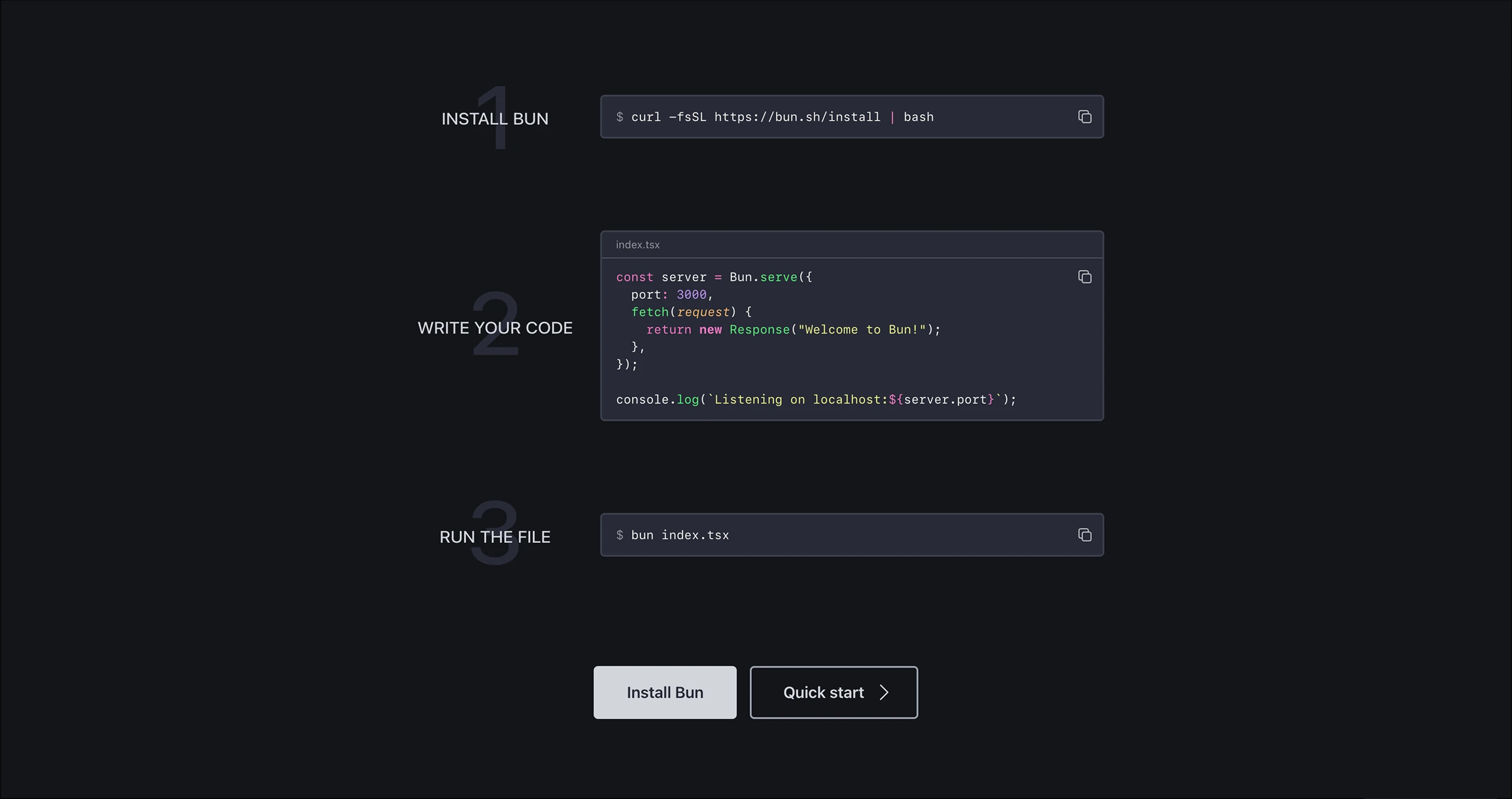
[Bun]: Key commands form the steps
8. Rich cards
Each feature gets its own custom design. Visually striking, but costly to develop.
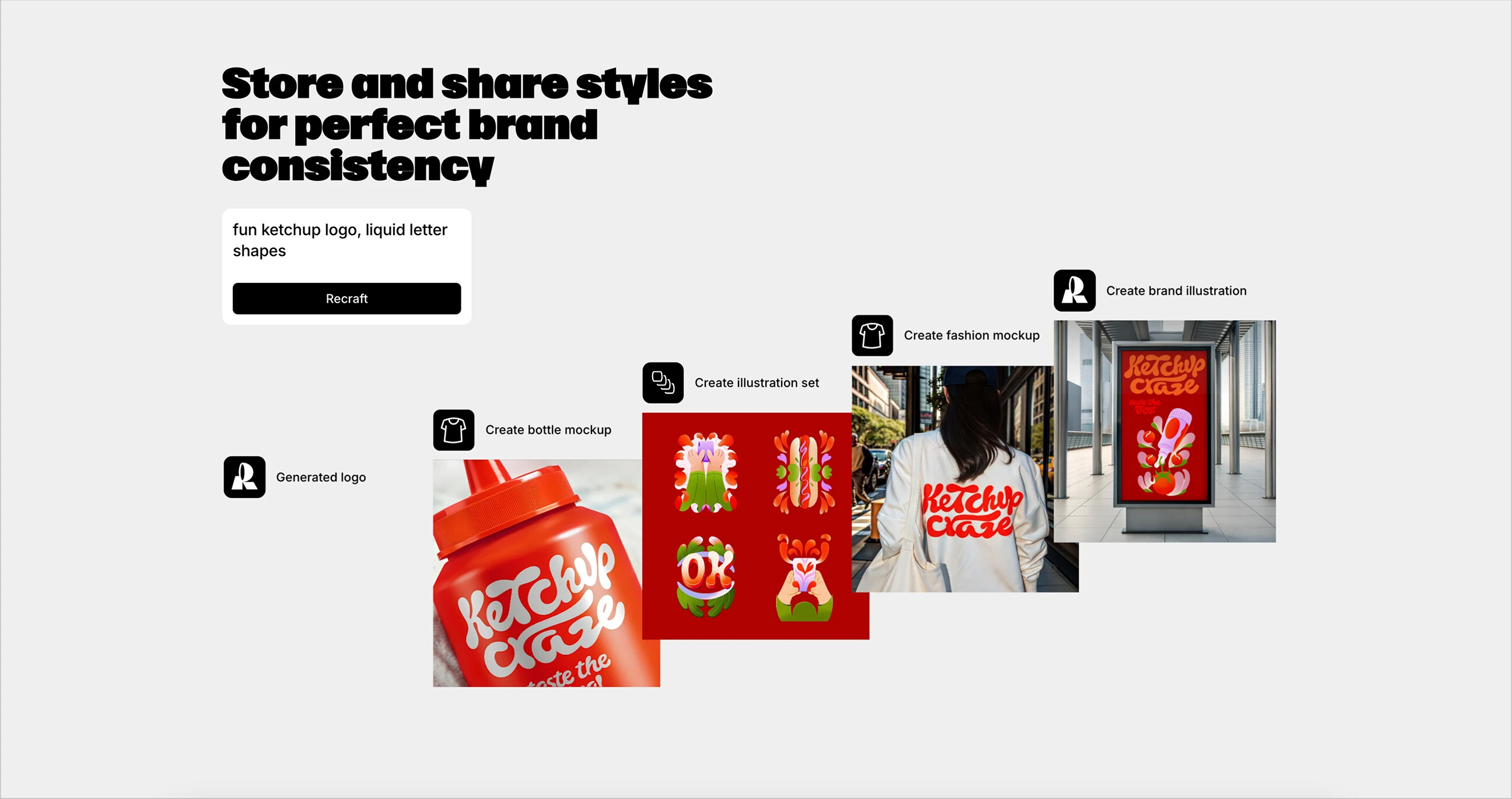
[Recraft]: Each feature has its own visual treatment
9. Video tutorials
Best for teams without time to create polished visuals. Embed a demo video to help users quickly understand the product.
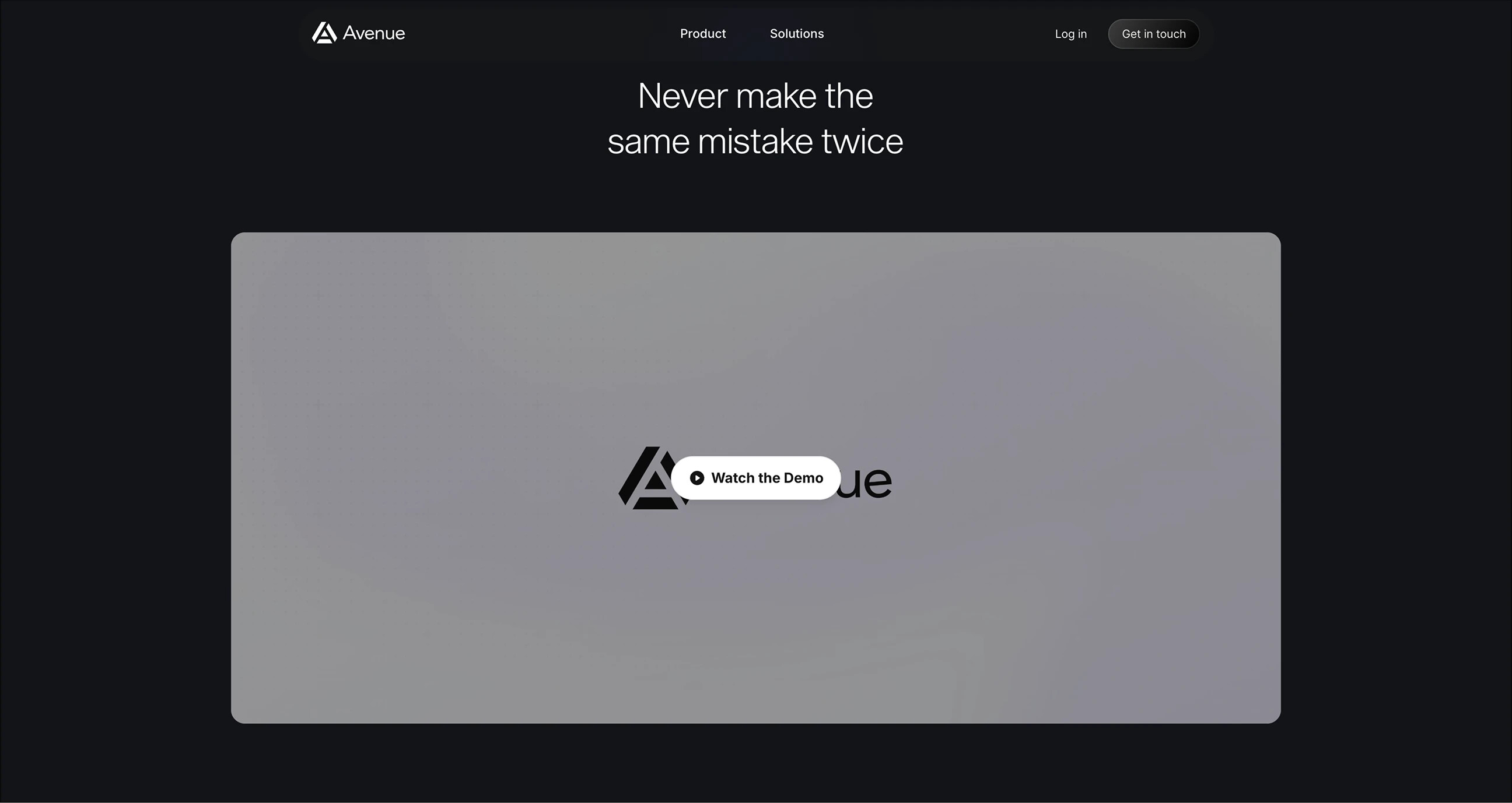
[Avenue]: A video demo below the Hero section
Additional sections that support the narrative
Some products add extra sections explaining how the product works, who it is for, and how it fits into users’ lives.
“How it works” section
Explains the product’s core ideas. Useful for products with a bit of “magic” involved, such as AI, automation, or background syncing.
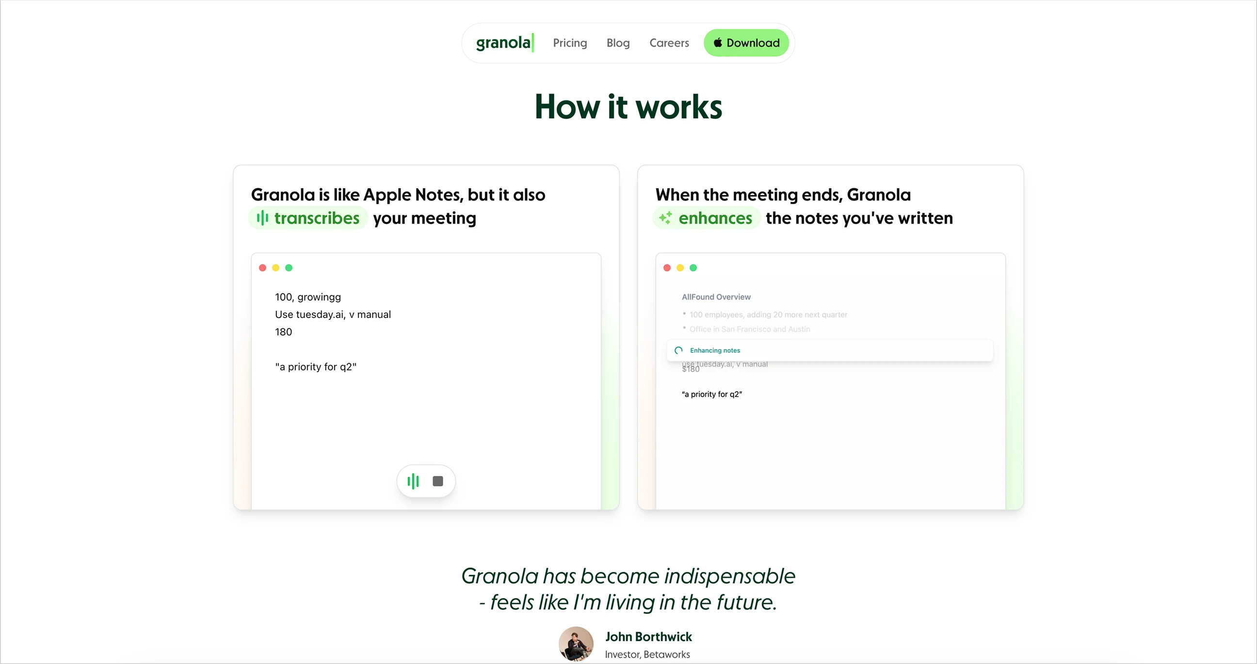
[Granola]: Explains the product’s core concepts
Usage examples
Common in tools for individuals or small teams. Show real outputs to spark inspiration.
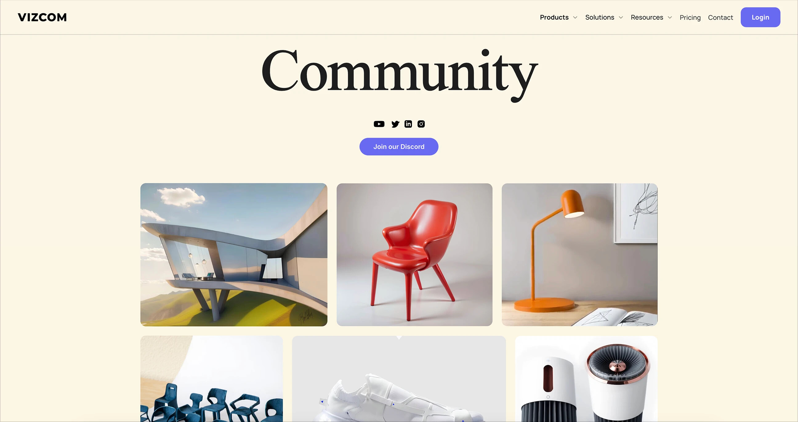
[Vizcom]: Examples of user-created designs
Compatibility/integrations
Display logos for supported platforms, services, and languages to signal maturity and help users assess compatibility.
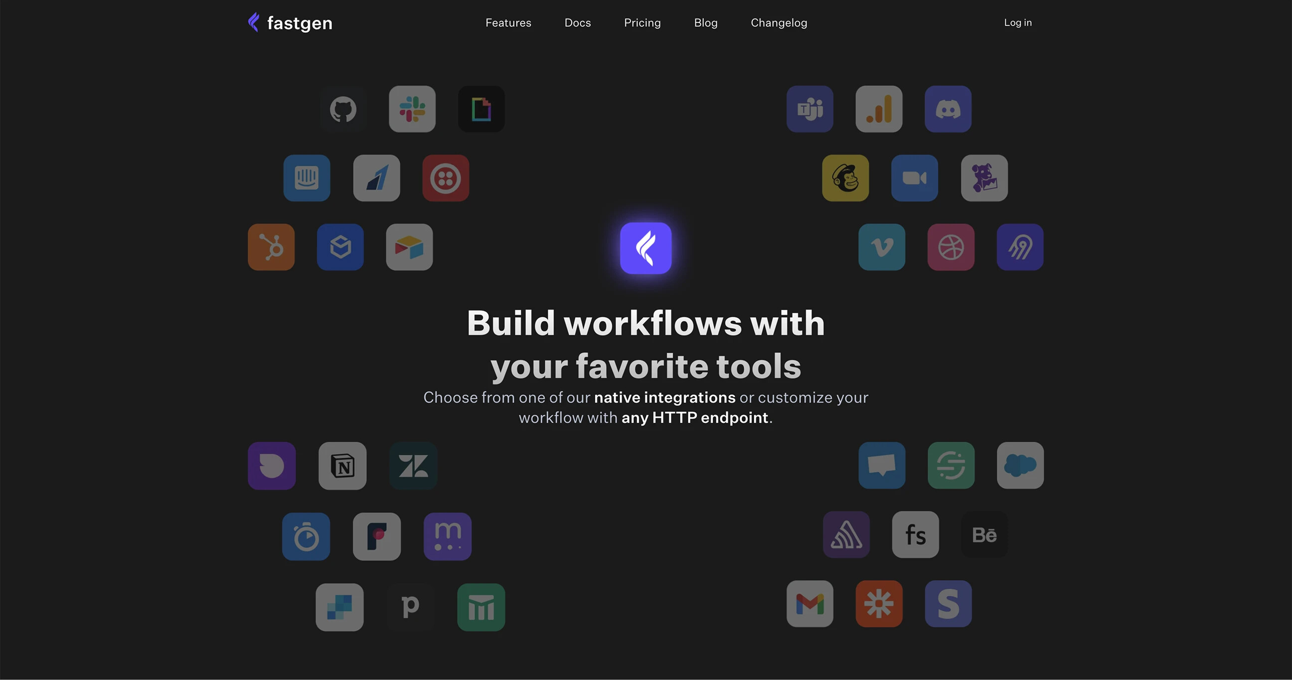
[Fastgen]: Visualizing integrations
Social proof sections
Summary: Curate the most relevant testimonials, even if you only have one.
Social proof is a core principle of developer marketing. Nearly all of the 100+ landing pages we studied use handpicked testimonials rather than automatically pulled tweets or comments. Even when they look like tweets or GitHub comments, they are usually manually selected and styled. No links, no embeds—just clean, controlled snippets of positive feedback.
Why? Because it is safer: only relevant, positive feedback is shown, and the reading experience is better.
!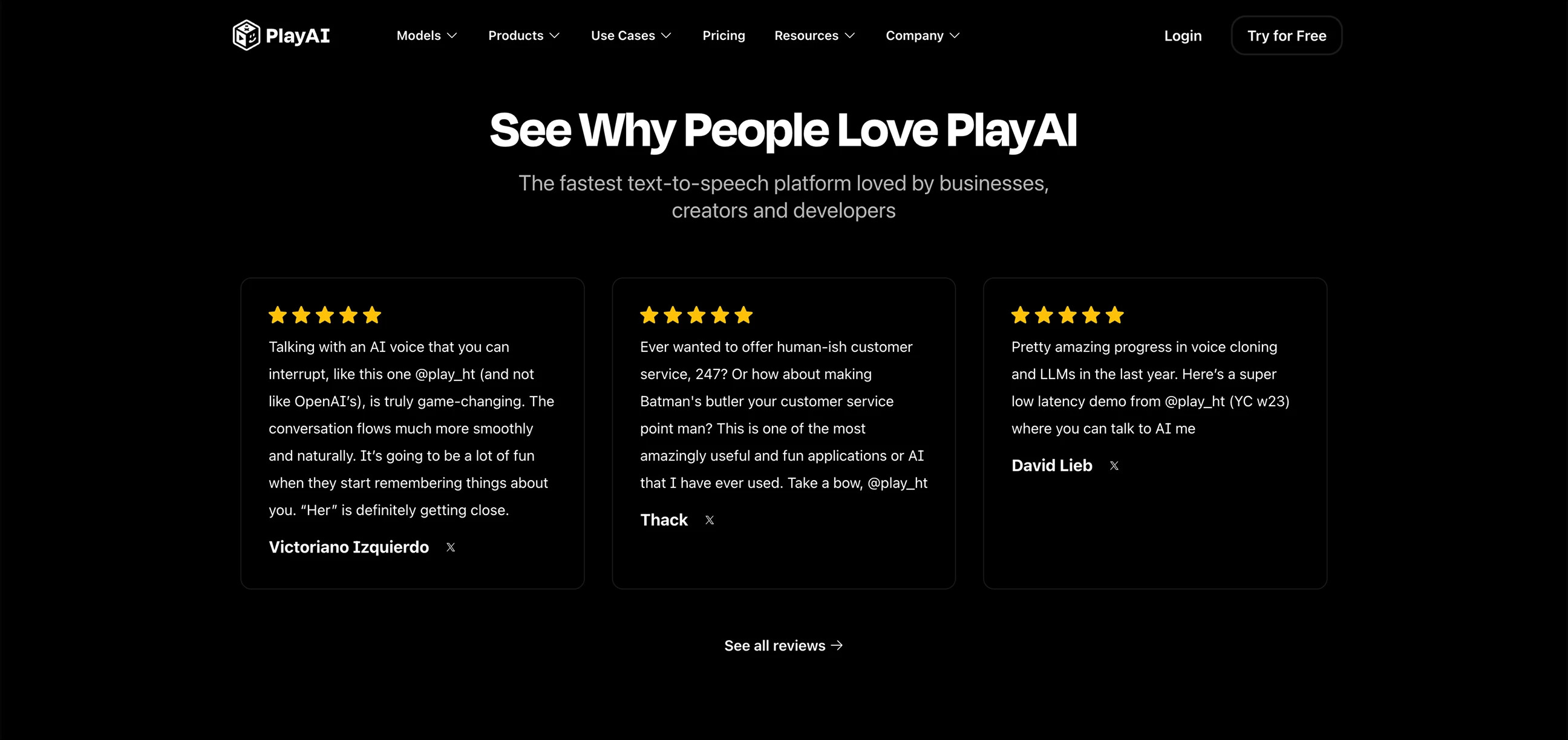
[PlayAI]: Curated and styled Twitter testimonials
This section usually sits near the bottom of the page, after the product story. A few short quotes are enough, paired with profile photos, names, and company logos for B2B products.
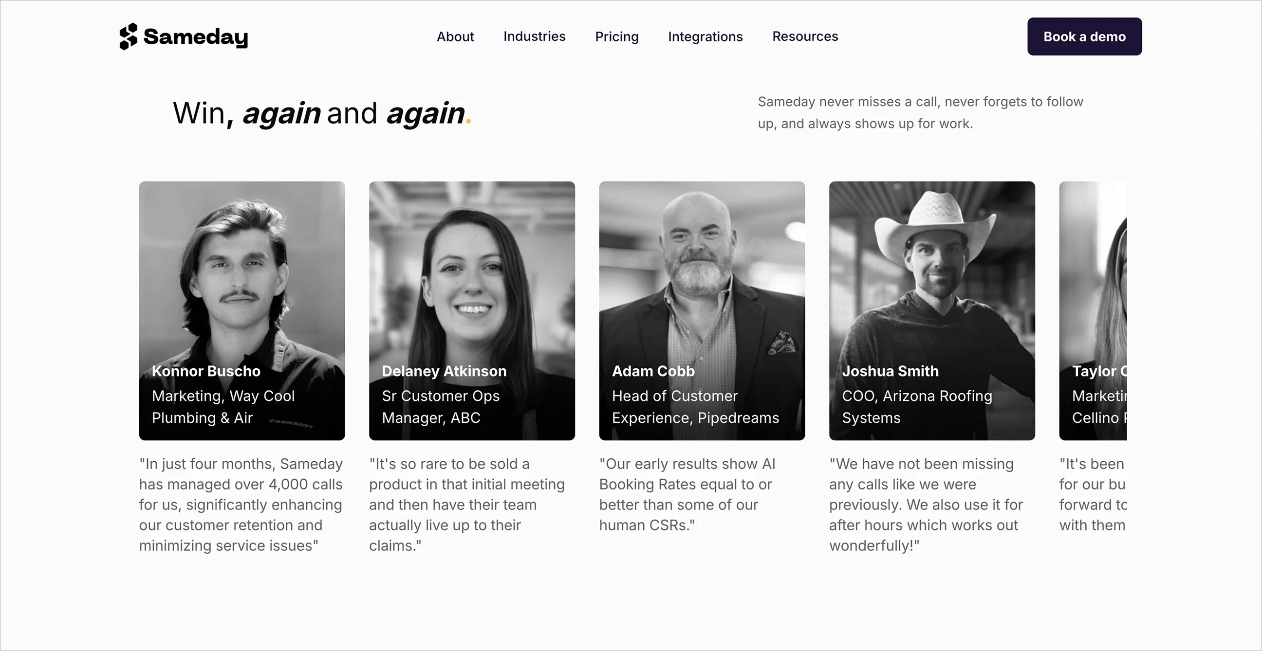
[Sameday]: Highlights users’ identities and companies
Even early-stage startups can benefit. Ask your first customers, teammates, or friends to write a sentence. That is enough to add a human touch and credibility.
As the product grows, you can automatically pull real comments from Twitter, GitHub, Discord, and elsewhere, but remember to review them. Linking to the source can build trust, provided the content is genuinely credible.
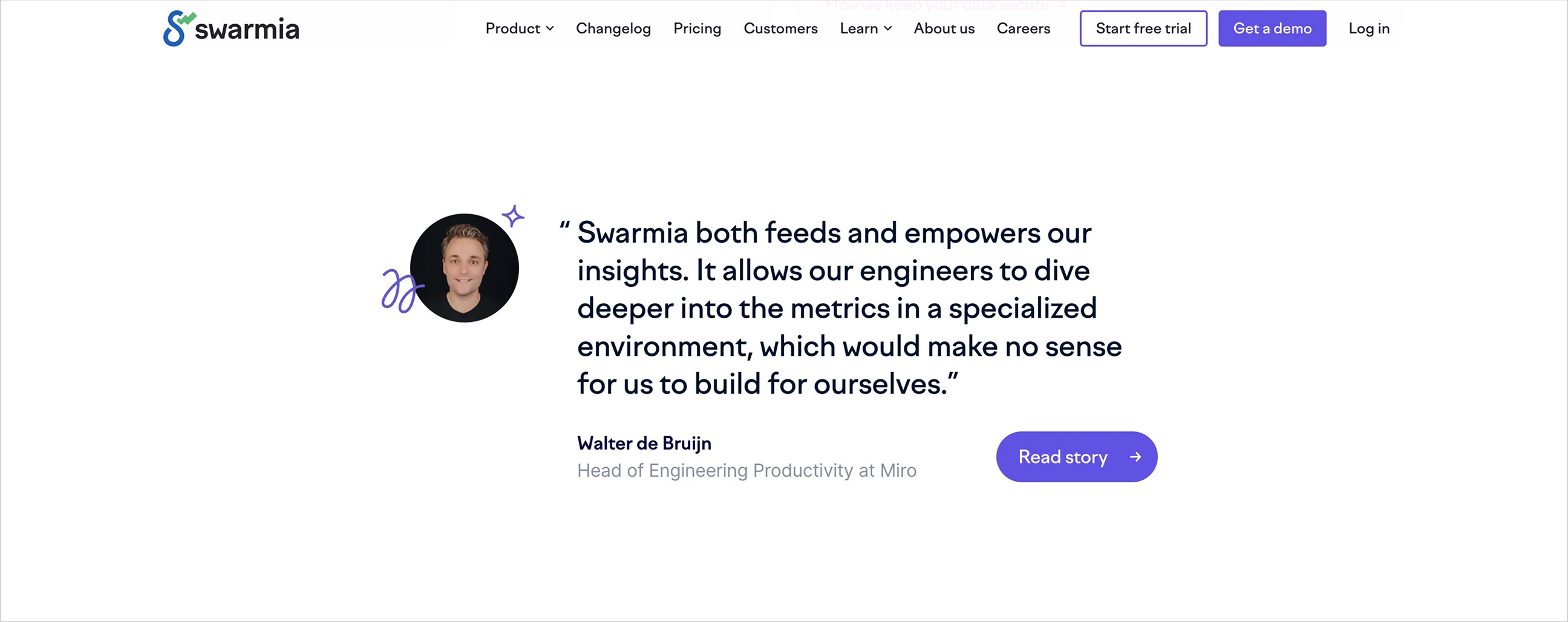
[Swarmia]: Showcases a single customer testimonial
A smarter approach: feature-specific quotes
Some teams go further, spreading testimonials across feature sections. For example, a feature description might be followed directly by a short, positive quote from a user. This gives social proof more context and reinforces the feature’s specific value.
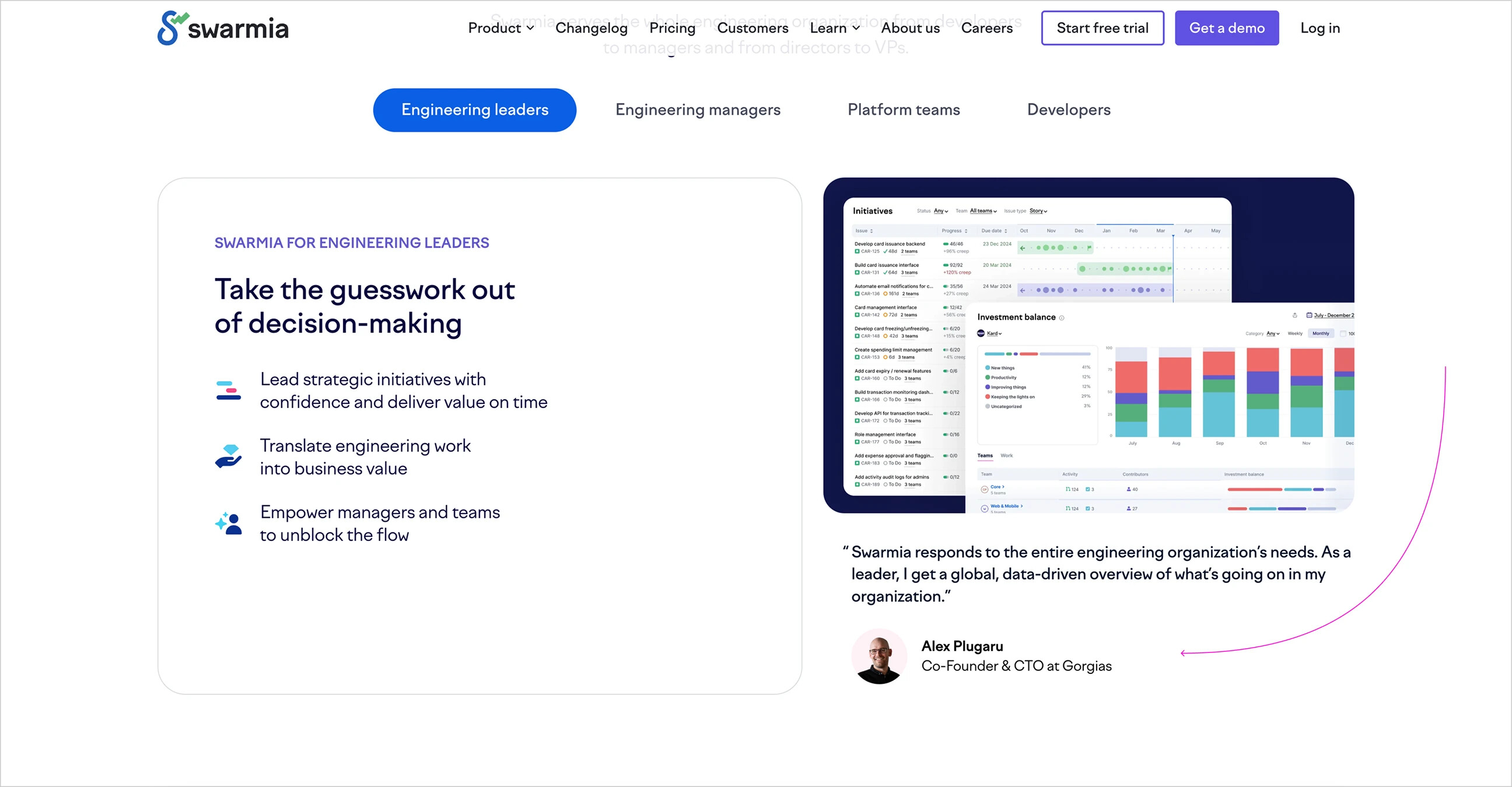
[Swarmia]: Add user testimonials alongside feature descriptions
Supporting Sections
Summary: Keep it simple. An FAQ is enough.
These aren't essential for early-stage products, but they're common among established teams or in competitive markets.
Comparison Tables
Compare your product with existing tools, usually in a table. The goal is to highlight that your tool is just as good, if not better.
This is useful for standing out in highly competitive markets, especially when your product isn't a disruptive innovation but instead focuses on execution, speed, developer experience, and so on. Common formats include side-by-side tables, checkmarks, or concise feature comparisons.
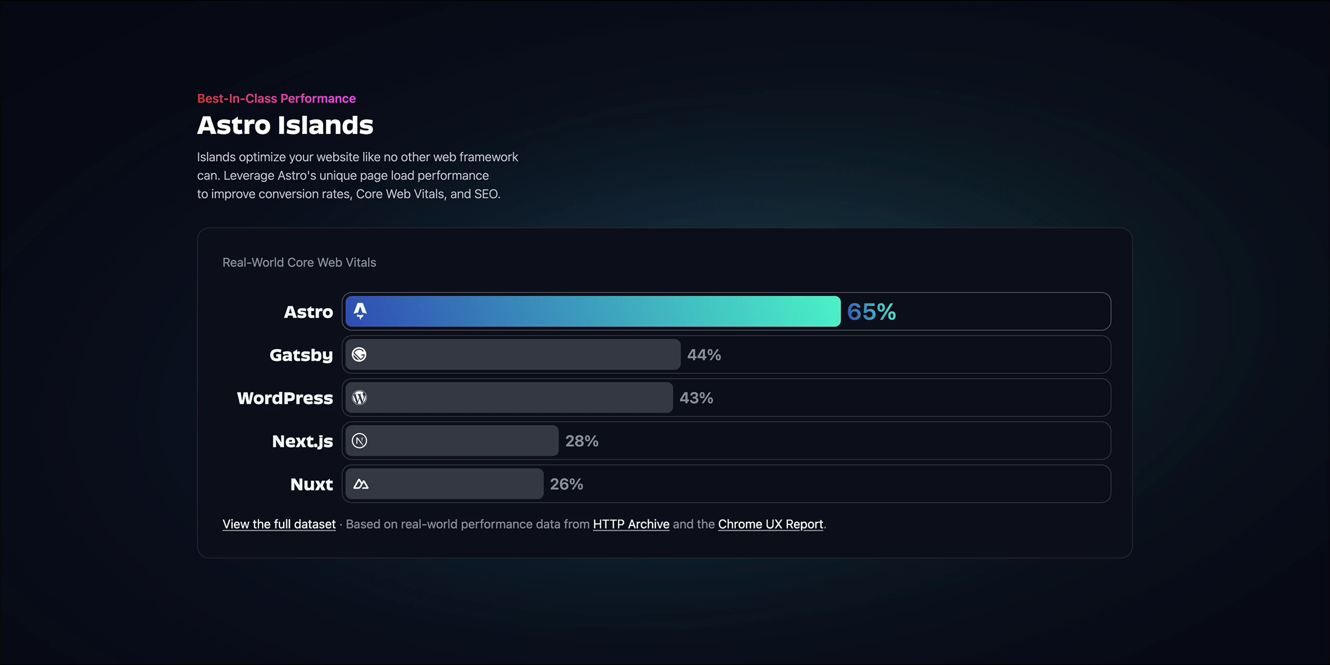
[Astro]: Performance comparison with mainstream frameworks
Pricing
Few landing pages show pricing directly; most put it on a separate page.
When pricing is shown, the design is usually simple: side-by-side plans, short labels (such as “Free,” “Pro,” and “Team”), feature lists, and CTA buttons. Some include a monthly/annual billing toggle.
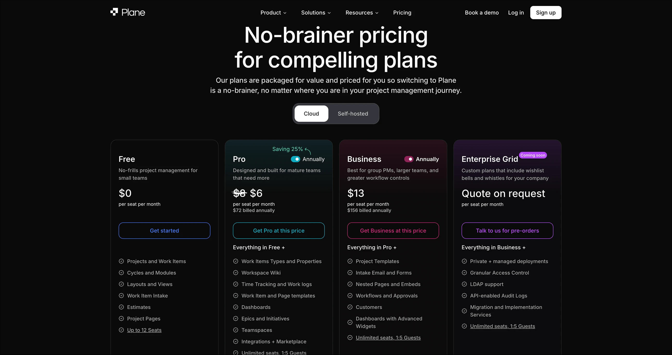
[Plane]: Plans displayed at the bottom of the main page
FAQ
Accordion-style FAQ sections are common, usually at the end of the page. They cover practical questions such as “What happens after the trial ends?”, “Do you store my data?”, and “Can I use it without logging in?”
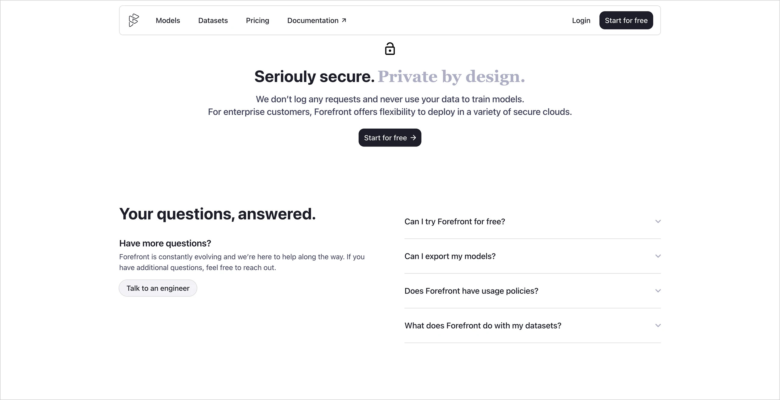
[Forefront]: FAQ section
Blog or Update Previews
Only a few established teams include these. They're usually narrow horizontal strips showing the latest blog posts or updates. The point isn't to drive traffic, but to send a signal: “We're active, we're iterating, and we care.”
In the early stages, just post updates on social media. Start a blog once someone can maintain it.
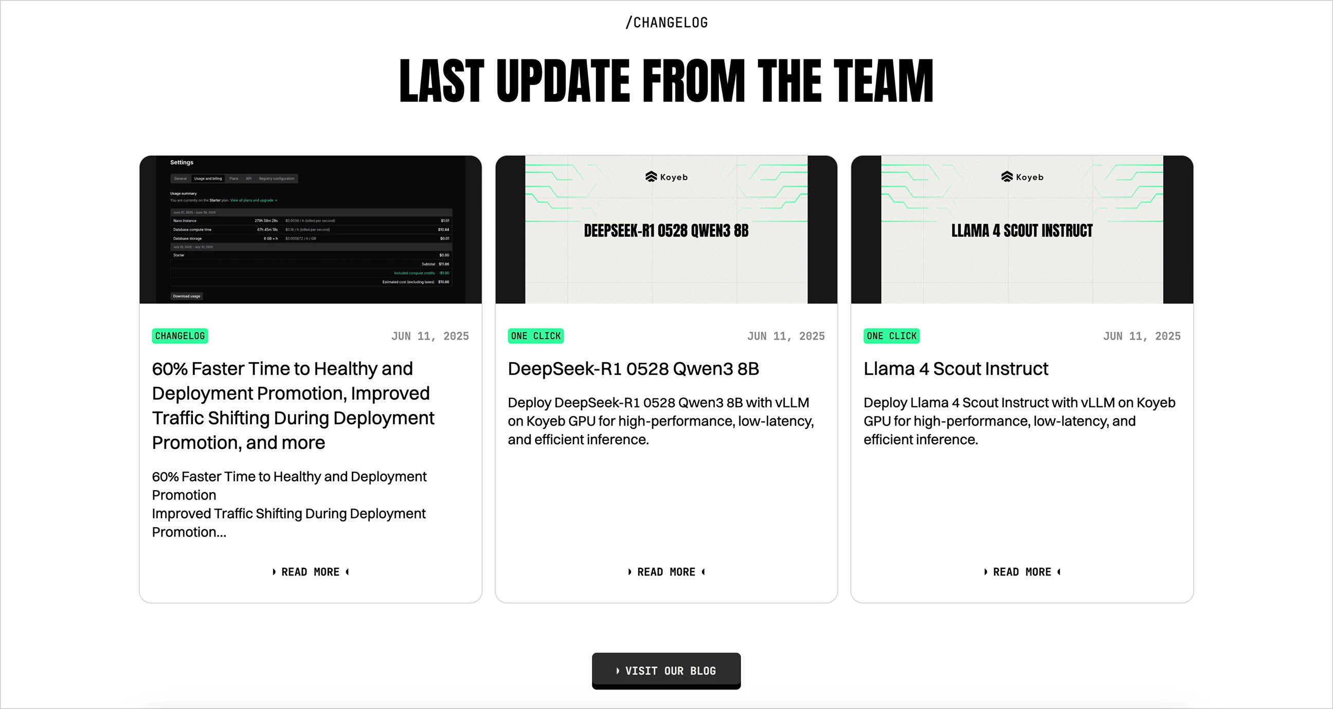
[Koyeb]: Latest updates
Final CTA
Summary: Make it big and prominent. Don't miss your final chance to convert.
A strong, standalone CTA—a full-width section that looks distinct from the rest of the page—is your last chance to prompt visitors to act.
The best approach is a distinctive background color (a bold color or light/dark contrast), a short motivational line, and one clear button: Get Started, Try a Demo, Book a Call, and so on.
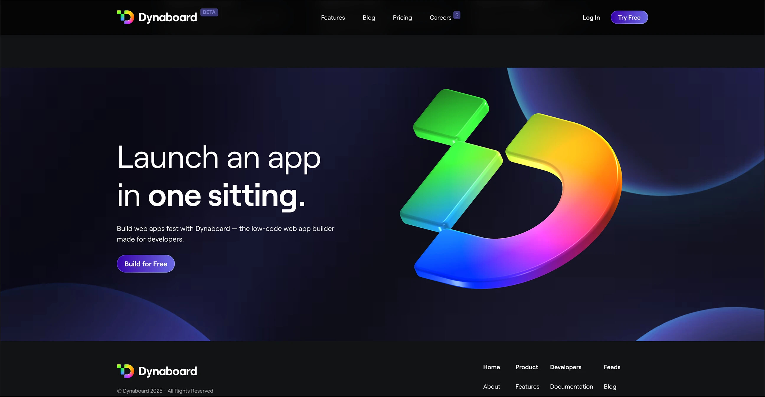
[Dynaboard]: Full-width animated CTA section
This section isn't decorative. A clear CTA at the bottom acts as a safety net, catching visitors who scroll all the way down but haven't clicked yet.
One clever example embeds a calendar widget directly in the CTA section, letting users immediately book a call with the CEO or CTO. For early-stage teams, this frictionless booking flow is more effective than yet another “Sign Up” button.
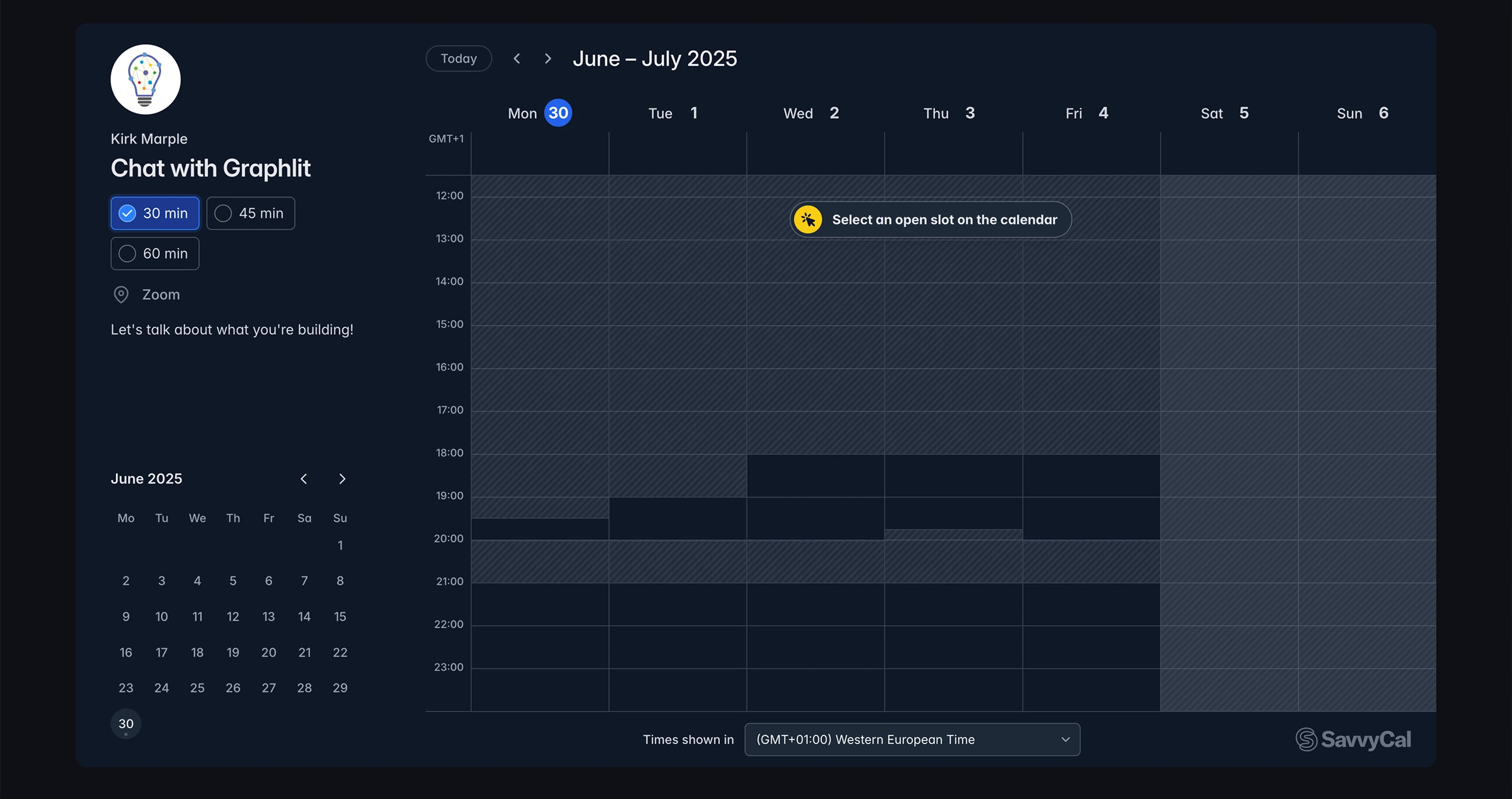
[Graphlit]: A calendar widget as the main CTA
Comments 0